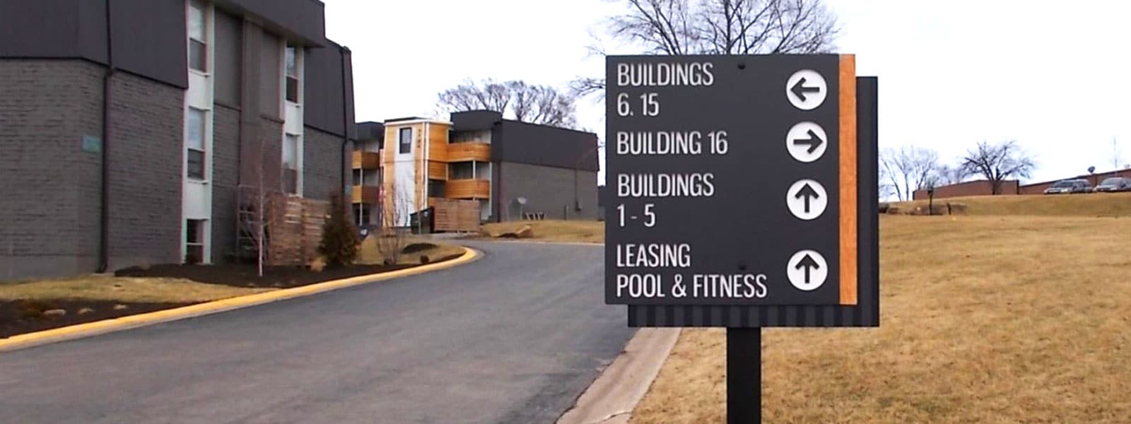
The location that an individual is in must be able to communicate information in a clear, concise manner. Consider the last time you travelled to a new town: the overarching branded environment provides information regarding the community’s personality, the daily activities that the neighborhood likely partakes in, the values of those who live there, and more. We often overlook how quickly we utilize visual information and notable landmarks to relay directions in today’s fast-paced life. Environmental graphic design (EGD) is a philosophy that comprehensively defines and creates the user experience. Wayfinding is a critical element of EGD that prioritizes efficient navigation by providing clear guidance to a destination. Every visual element of a customer’s journey should reinforce the desired perspectives on your business to encourage an approachable customer experience.
When considering the financial and business implications of ineffective wayfinding, the potential for negative repercussions grows immensely (imagine not even finding the right building because they did not have a sign!).
Wayfinding can be considered visual shorthand to provide complex information quickly. A wayfinding strategy that users easily understand involves several parts that work together, going above and beyond graphic design. Wayfinding touches elements of lighting, architecture, interior design, and how users will utilize the environment.
Considering wayfinding in the initial development stages will allow your location to speak more clearly to your audience. Creating a comprehensive navigation system requires a balance of naming, numbering, coloring, symbolism, aesthetics, and delivered messages. This begins a comfortable and positive relationship with the user as they confidently navigate and understand the environment you have carefully established.
- Universal Symbols
- Symbols describe important information to users to intuitively understand directions and warnings
- The quick comprehension of communication that comes from the “STOP” sign, directional arrows, “Do Not Enter”, and more is vital with complex and busy environments
- Colors
- Colors used in an environment subconsciously prime us with information regarding the intended use and personality of an environment. This can be seen locations like hospitals that use blue to invoke calmness, and fast food chains using red and orange to activate hunger.
- Colors can also be used for quick visual identifiers of placemaking across cities and districts, efficiently gathering and uniting multiple areas in a location. Color is a quick and easy means of organizing the area and driving the emotional connection with users.
- Maps
- When entering a shopping mall, visitors are often presented instantly with a map of the building. This gives individuals a mental mapping of their journey through the property.
- The stronger and more clearly a mental map is established with each user, the easier it is for them to return to the location and bring others with them, driving business. (See On50’s Map)
- Location
- Placemaking creates a distinct environment for the user. People that often interact with a space may refer to the location with a strong identifying factor of it, like an element of its architecture, a name of a room, or some installment within it.
- Locations are usually remembered by their landmarks and items that individuals first identify about an area. These landmarks are distinct from others in the wayfinding system, but seemingly deliver a similar branded message.
- Visibility
- The visibility of your signage is critical not only for permit legality and ADA-compliance, but also to ensure your signage system is useful to visitors with the proper placement, sight lines, accessibility, lighting, and congruence with other signage.
- Functionality
- Messaging should always be relevant to ensure your visitors retain information. Informational overload, in addition to excessive design frills, hamper wayfinding efforts.
- Timing is a function of wayfinding that is reliant on the architecture of the space as well. As users enter your environment, their guided journey is a form of storytelling that the brand uses to build rapport with the visitor. Therefore, it is important to consider the sequence and timing of what information is presented to the user to create a clear mental map of their journey.
There are several moving parts to the creation of an aligned wayfinding experience. Wayfinding signage has the power to communicate information, direction, and identification in a relevant and time sensitive manner. We rely on this in our everyday actions to accomplish the goal of gaining more knowledge and reaching a desired location. Signage also is accommodating and can be updated to reflect changes in the surroundings. Achieving the correct combination of these elements in your company’s signage impact the user experience for a confident, personable, and resonating relationship between brand and consumer.
